WelcomeScreen
When the canvas is empty, Excalidraw can show a welcome splash screen with a logo, a few quick action items, and hints explaining what some of the UI buttons do. Once the user picks a tool, or has created an element on the canvas, the welcome screen will disappear.
You can enable this behavior by rendering a WelcomeScreen component like this:
You can also customize the welcome screen by passing children to the WelcomeScreen component. See below.
This is the main component. If you render it without any children, we will render the default welcome screen.
You can customize which welcome screen subcomponents are rendered by passing them as children.
The welcome screen consists of two main groups of subcomponents:
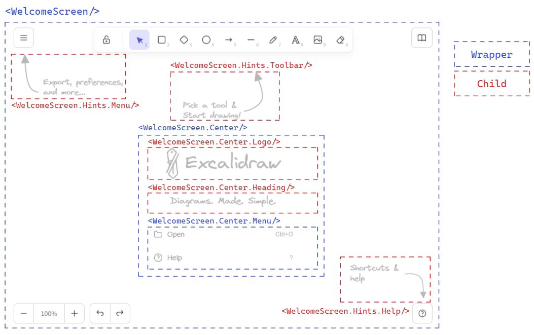
Center
<WelcomeScreen.Center/> subcomponent is the center piece of the welcome screen, containing the logo, heading, and menu. All three subcomponents are optional, and you can render whatever you wish into the center component.
Logo
Use the <WelcomeScreen.Center.Logo/> to render a logo. By default it renders the Excalidraw logo and name. Supply children to customize.
Heading
Use the <WelcomeScreen.Center.Heading/> to render a heading below the logo. Supply children to change the default message.
Menu
<WelcomeScreen.Center.Menu/> is a wrapper component for the menu items. You can build your menu using the <WelcomeScreen.Center.MenuItem> and <WelcomeScreen.Center.MenuItemLink> components, render your own, or render one of the default menu items.
The default menu items are:
<WelcomeScreen.Center.MenuItemHelp/>- opens the help dialog.<WelcomeScreen.Center.MenuItemLoadScene/>- open the load file dialog.<WelcomeScreen.Center.MenuItemLiveCollaborationTrigger/>- intended to open the live collaboration dialog. Works similarly to<LiveCollaborationTrigger>and you must supplyonSelect()handler to integrate with your collaboration implementation.
MenuItem
The <WelcomeScreen.Center.MenuItem/> component can be used to render a menu item.
| Prop | Type | Required | Default | Description |
|---|---|---|---|---|
onSelect | function | Yes | The handler is triggered when the item is selected. | |
children | React.ReactNode | Yes | The content of the menu item | |
icon | JSX.Element | No | The icon used in the menu item | |
shortcut | string | No | The keyboard shortcut (label-only, does not affect behavior) |
WelcomeScreen.Center.MenuItemLink
To render an external link in a menu item, you can use this component.
| Prop | Type | Required | Default | Description |
|---|---|---|---|---|
href | string | Yes | The href attribute to be added to the anchor element. | |
children | React.ReactNode | Yes | The content of the menu item | |
icon | JSX.Element | No | The icon used in the menu item | |
shortcut | string | No | The keyboard shortcut (label-only, does not affect behavior) |
Hints
These <WelcomeScreen.Hints.*> subcomponents render the UI hints. Text of each hint can be customized by supplying children.
MenuHint
<WelcomeScreen.Hints.MenuHint> hint subcomponent for the main menu. Supply children to customize the hint text.
ToolbarHint
<WelcomeScreen.Hints.ToolbarHint> hint subcomponent for the toolbar. Supply children to customize the hint text.
Help
<WelcomeScreen.Hints.Help> hint subcomponent for the help dialog. Supply children to customize the hint text.