UIOptions
This prop can be used to customise UI of Excalidraw. Currently we support customising canvasActions, dockedSidebarBreakpoint welcomeScreen and tools.
{
 canvasActions?: CanvasActions,
 dockedSidebarBreakpoint?: number,
 welcomeScreen?: boolean
}
canvasActions
This prop controls the visibility of the canvas actions inside the menu.
| Prop | Type | Default | Description |
|---|---|---|---|
changeViewBackgroundColor | boolean | true | Indicates whether to show Background color picker. |
clearCanvas | boolean | true | Indicates whether to show Clear canvas button. |
export | false | exportOpts | object | This prop allows to customize the UI inside the export dialog. By default it shows the save file to disk. For more details visit exportOpts. |
loadScene | boolean | true | Indicates whether to show Load button. |
saveToActiveFile | boolean | true | Indicates whether to show Save button to save to current file. |
toggleTheme | boolean | null | null | Indicates whether to show Theme toggle. When defined as boolean, takes precedence over props.theme to show Theme toggle. |
saveAsImage | boolean | true | Indicates whether to show Save as image button. |
exportOpts
The below attributes can be set in UIOptions.canvasActions.export to customize the export dialog.
If UIOptions.canvasActions.export is false the export button will not be rendered.
| Prop | Type | Default | Description |
|---|---|---|---|
saveFileToDisk | boolean | true | Indicates whether save file to disk button should be shown |
onExportToBackend | object | _ | This callback is triggered when the shareable-link button is clicked in the export dialog. The link button will only be shown if this callback is passed. |
renderCustomUI | object | _ | This callback should be supplied if you want to render custom UI in the export dialog. |
dockedSidebarBreakpoint
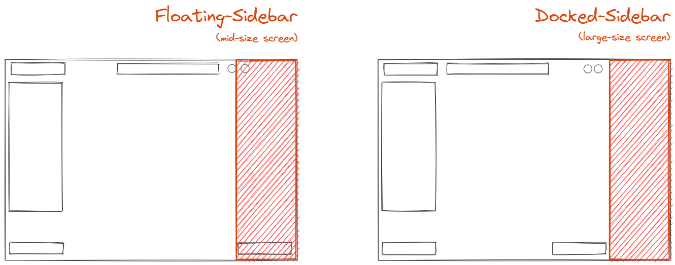
This prop indicates at what point should we break to a docked, permanent sidebar. If not passed it defaults to MQ_RIGHT_SIDEBAR_MAX_WIDTH_PORTRAIT.
If the width of the excalidraw container exceeds dockedSidebarBreakpoint, the sidebar will be dockable and the button to dock the sidebar will be shown
If user choses to dock the sidebar, it will push the right part of the UI towards the left, making space for the sidebar as shown below.

tools
This prop controls the visibility of the tools in the editor.
Currently you can control the visibility of image tool via this prop.
| Prop | Type | Default | Description |
|---|---|---|---|
| image | boolean | true | Decides whether image tool should be visible. |